
Designing an email that looks great on all devices is no easy task, and for designers and marketers everywhere, it’s an everyday challenge presented with email campaigns.
With most of email opens happening on phones, how well you design for mobile can often make or break the success of your entire email campaign.
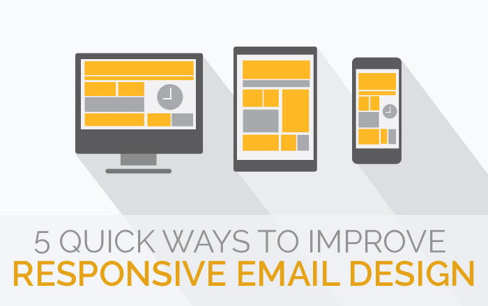
Given this, how should you approach responsive email design? This excerpt from an Email Monks infographic gives 14 quick tips for making sure your emails look great and are easy to read on all devices.

Key Takeaways
- Make text easy to read. Use a large font size so that text can be read easily and at a glance. If people have to pinch, zoom, and squint to read a simple email, they probably won’t read it. Set your base font size to 16px for body text and then adjust the size relative to that base size for titles, sub headings, links, and so on. Don’t forget to provide enough vertical space between characters so that your text has room to breathe. Setting your line-height to 1.2em is a good place to start.
- Increase the color contrast. Often times a color that looks great on a desktop doesn’t translate well on mobile. On a small screen, subtle hues and shades of color are harder to read, especially with body text. As general rule of thumb, use dark colors on a white or light background for body text. For buttons and navigation, use white text on a darker or more saturated background.
- Design large, bold CTAs. Getting people to open an email is the first half of the battle when it comes to email campaigns. The second half is getting them to take action. Make sure you design a call-to-action (CTA) that’s big enough for large thumbs to tap. Try using 44-50px square as a starting point.
- Design for mobile first. If you’re used to designing for desktop first, it may be time to change things up with a “mobile-first” approach. All that really means is using simpler layouts that will be easier to view on all devices. Try applying a single column template to your email. If your design calls for two or more columns, think about how the columns should stack on mobile devices, then use media queries to customize the styles for different screen sizes and orientations.
- Use tappable phone numbers. Make it easy for mobile users to contact you by providing a call to function number. All they have to do is tap your phone number to call you.
- Place CTAs above the fold. Place your CTAs high up in your email, above the fold, for best results. Leave plenty of white space around it to make it stand out from other text and capture people’s attention.
- Preview your responsive email design. It’s one thing to view your design in Photoshop, and an entirely different thing to experience it on a real device, before going into development. Liveview is an app that syncs with an iOS device to preview a region of your Mac screen on your phone. This is a great way to see what your design looks like in real time, so you can tweak spacing, contrasts, font sizes, buttons, colors, and so on, until you have it just right.
- Don’t forget to test. Perform a quick test on your responsive email design before sending to your readers. You want to make sure it looks the way you expect it to and is compatible with all email clients.
Responsive email design is critically important for the success of email campaigns. It requires designers and marketers to approach email from the perspective of how users experience content on different screen sizes and orientations. Applying these guidelines to your email campaign will make your content easy to consume on any device, which gives you a greater chance of convincing people to take action.