
One concept that has always been of particular interest to me is the universal space that design occupies, somewhere between the written word and fine art. I’ve always thought that good design has a viewpoint – it tells a story. Even the subtlest detail or splash of color gives you an entirely different ending.
It’s a delicate world that fashion designers, architects, interior designers, landscape architects and graphic designers live in to achieve symmetry, balance, and ultimately, success.
And whether marketers realize it or not, they live in that world too. When it comes to increasing inbound conversions, landing pages and websites are about more than placing an image here or a button there. Marketers need to take people on a journey, and it has to be the right journey.
Given this, it surprises me that many marketers still overlook the importance of color and design on their campaigns.
Just what is the connection between color, design and conversion rates?
Visual Hierarchy
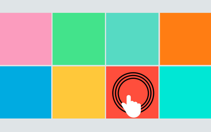
Color is used to distinguish elements and to indicate the relative importance of one over the other. Ever noticed how certain parts of a site immediately grab your attention and are the first things you see? A button or call-to-action is a good example of how color and design are used to make something stand out against the rest of the page. This concept is known as “Visual Weight” or “Hierarchy”.
It’s not just the color choice that gives certain elements more weight and makes people want to click. The color of a font or button provides little context on its own. It’s how they relate to each other. By using contrasting colors and white space, you can emphasize what messages and buttons to focus on, which ones are interactive, and where users should go next.
Visual Perceptions
Color has a lot to do with our visual perceptions of size. What most people don’t realize, and something I learned from dabbling in fashion design, is that color can make one thing appear to be larger than another, even when they are the same size. With clothing, an orange top on a light skin tone will make the shoulders appear to be larger than they are, while dark pants make the hips appear to be smaller.
Say, for instance, you place four square boxes of equal size on a page and apply different colors to each. Even though they are the same size, one of them will appear to be larger. The tone of the color plays also plays a big role how we perceive scale. Generally speaking, saturated colors will seem larger than softer hues and tones. Background colors plays a big role in how we perceive size too. If you take those same four boxes and use a different color behind them, another color will seem larger.
If we apply this concept to websites, using a bright color for the most important aspects, such as a button or CTA, will give it emphasis and prominence and is more likely to attract clicks.
User Journey
Strategically placed elements and thoughtful color solutions transform your message from plain text to a visual road map. Given that color selection, positioning, and scale all work together to capture visual attention, you give signals to users that tell them what is important and where to go instantly. In this way, the use of white space and color directs users and clarifies their journey.
Emotion and Color
What many marketers may not know is that color influences mood and emotions. They have meanings that are working on a deep psychological level. In fact, according to Neil Patel, color accounts for 85% of the reasons why people purchase a product. And visitors will make immediate judgments based solely on how they feel when they first arrive at your website.
Here is where personas help guide branding, color and design. An understanding of your market and customer base will help guide primary and secondary color selections that will evoke the emotions you want.
In general, people react to colors in a similar way. For instance, blues and greens tend to make people feel at ease, reassured, and trusting. Black conveys a sense of exclusivity and Is frequently used by luxury brands and law firms. Gray, on the other hand, is a neutral color that works well as a complimentary or secondary color, but over-use it and you run the risk of boring and depressing visitors.
Red is dynamic, evokes action, and is often used for CTA and priority links. Here again, too much of it and you’re likely to create the opposite mood and make people feel angry or upset. Orange is another active color, one that’s also energizing and playful.
How well colors are combined and work together will also influence moods and feelings. For example, a bright orange CTA will draw attention on a blue page and indicate to users that they should take action. This same orange CTA will get fewer clicks if the color palette for the entire page is also orange, so it pays to think ahead when choosing color combinations.
Clarity and Communication
It’s estimated that you have about 90 seconds to grab your readers’ attention. They subconsciously make assumptions and decisions on your product in 90 seconds. Since content takes much longer to read than 90 seconds, the right color or design can create less friction and encourage conversions in a subtle way.
People are visual by nature – we like directions and signs that tell us where to go next. We can make associations between color, shapes, and data without too much effort. We’ve been doing it for years.
But put blocks of text on a page and you’ll distract users and make them lose interest in your message. By using color and design to transform content into visual messages, you can help users make sense of complex data and stay focused on the next action to take.
The bottom line is that design and color are forms of visual communication. If your visual communication is poor, people will have a hard time understanding it and will be less likely to convert. If your visual communication is strategic and well planned, you’ll make visitors happy and get more clicks and conversions.
Key Takeaway
Today more than ever, color and design are crucial to website conversion rates. People are consuming tons of information at lightning speeds and marketers have to rely on visual communication to cut through the clutter, get your message heard by the right audiences, and get the click. Without effective communication, conversion rates will only suffer.